

Working for an international organisation, I’m constantly in a cycle of forward planning and trying to optimise global impact. There are a number of data sets that can help with this—for example, all of the countries with certain types of infrastructure—but they require a degree of piecing together.
Some of the problems I’ve faced:
- There is no central data repository and a possible resistance to producing one.
- Different databases might use different formats, e.g., country names or ISO codes.
- Sometimes unstructured data is provided, which may reflect the contributor’s biases, e.g., alternate or unofficial country names.
This can make effective planning kind of hard. I want maps. I love maps. So why not build a map? I’ve created a small tool to do exactly that, which is available here: https://mitcdh.github.io/cb2geochart/
Source: https://github.com/mitcdh/cb2geochart
Let’s run through how it’s built.
Building a List of Country Names
So the first thing is we need to get over the hurdle of everyone using different forms of country names. I found a very nice Wikipedia page listing everything in a single place, so I just needed to extract the information from it. Python to the rescue!
https://github.com/mitcdh/country-scraper
The script retrieves the webpage content using an and parses it for any row that contains an ISO 3166-1 alpha-3 country code. This code is then used to look up detailed country information from pycountry which is compiled together with the alternate country names from Wikipedia. It then employs case folding and Unicode Normalization Form Compatibility Decomposition to ensure consistency in the names before outputting it all in a JSON file, let’s call it countries.json.
As an example:
  {
    "name": "Austria",
    "alpha_2": "AT",
    "alpha_3": "AUT",
    "numeric": "040",
    "iso_alternate": [
      "republic of austria"
    ],
    "wikipedia_alternate": [
      "republik o\u0308sterreich",
      "o\u0308sterreich"
    ]
  },
Making Maps
Google has a very nice ‘geochart’ package, a component of Google Charts designed specifically for geographical data representation that accepts an ISO 3166-1 alpha-2 country code as input.
Now, we can look for alpha-2 country names using any of the country’s official names, alpha-2, alpha-3 code, or its alternate names from ISO or Wikipedia. This best-effort method ensures that the country data is accurately identified regardless of the input format, ensuring that as many entries as possible are plotted on the map.
Now, this sounds all boring and technical, but imagine having a magical map that comes to life with just a simple copy-paste. I’d previously become very intrigued with the workflow of clipboard2markdown and thought it would be perfect to apply here as well. Picture yourself with a list of countries, trying to normalise their names from your own memory, tediously entering each one by one, removing duplicates, or playing with some obscure Excel addon. Does it sound painful? Now you just copy your list, and voilà – you paste it into this special area on the webpage, and you get a map.
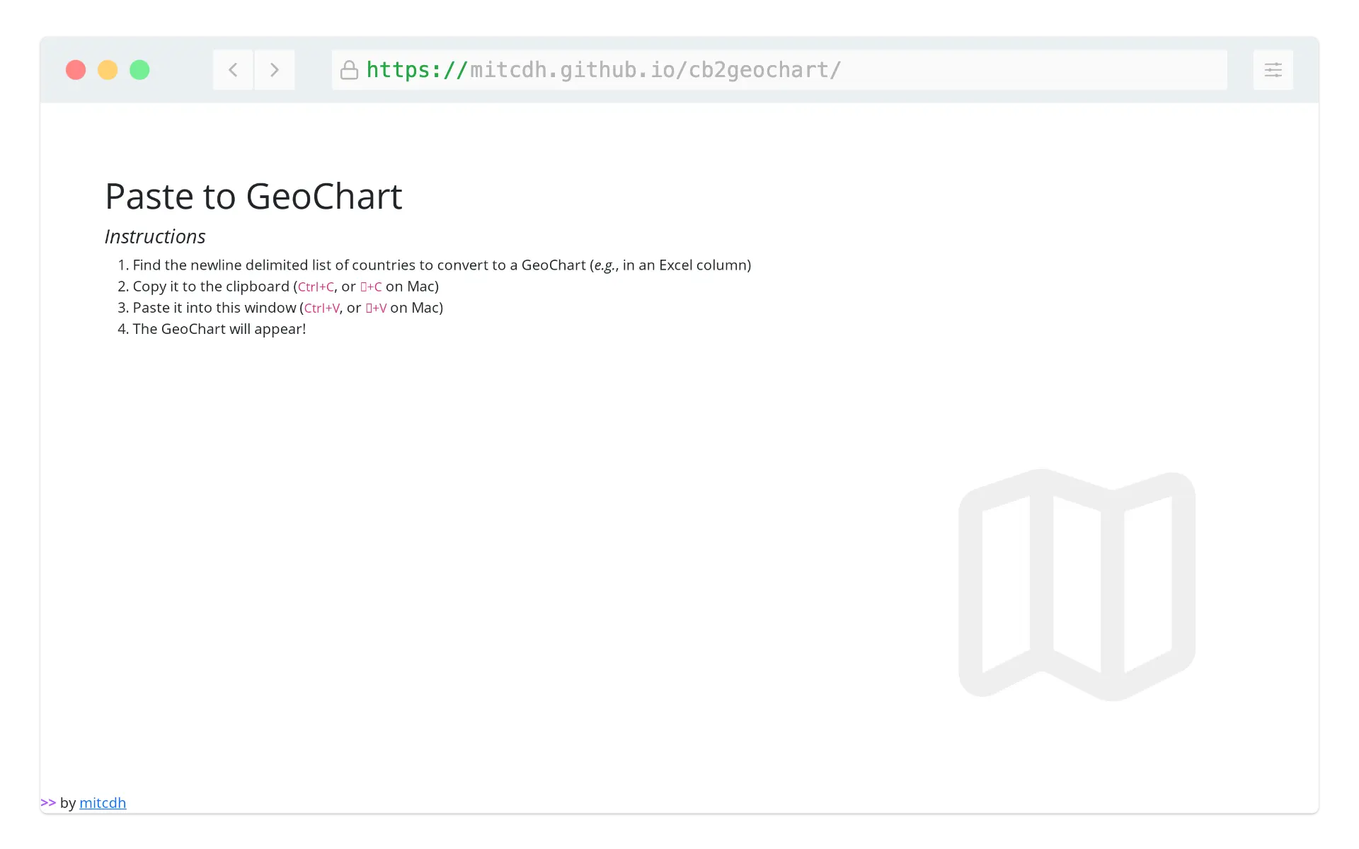 cb2geochart interface
This isn’t just about maps and countries; it’s about making things easier and more enjoyable. I built this for myself but wanted to share it, I have no idea who will use it. Whether you’re a teacher looking to bring lessons to life, a student on a quest for knowledge, or doing something fancy and professional with global markets (please verify the output, non-matches are logged to console.log), I hope you find some use in it.
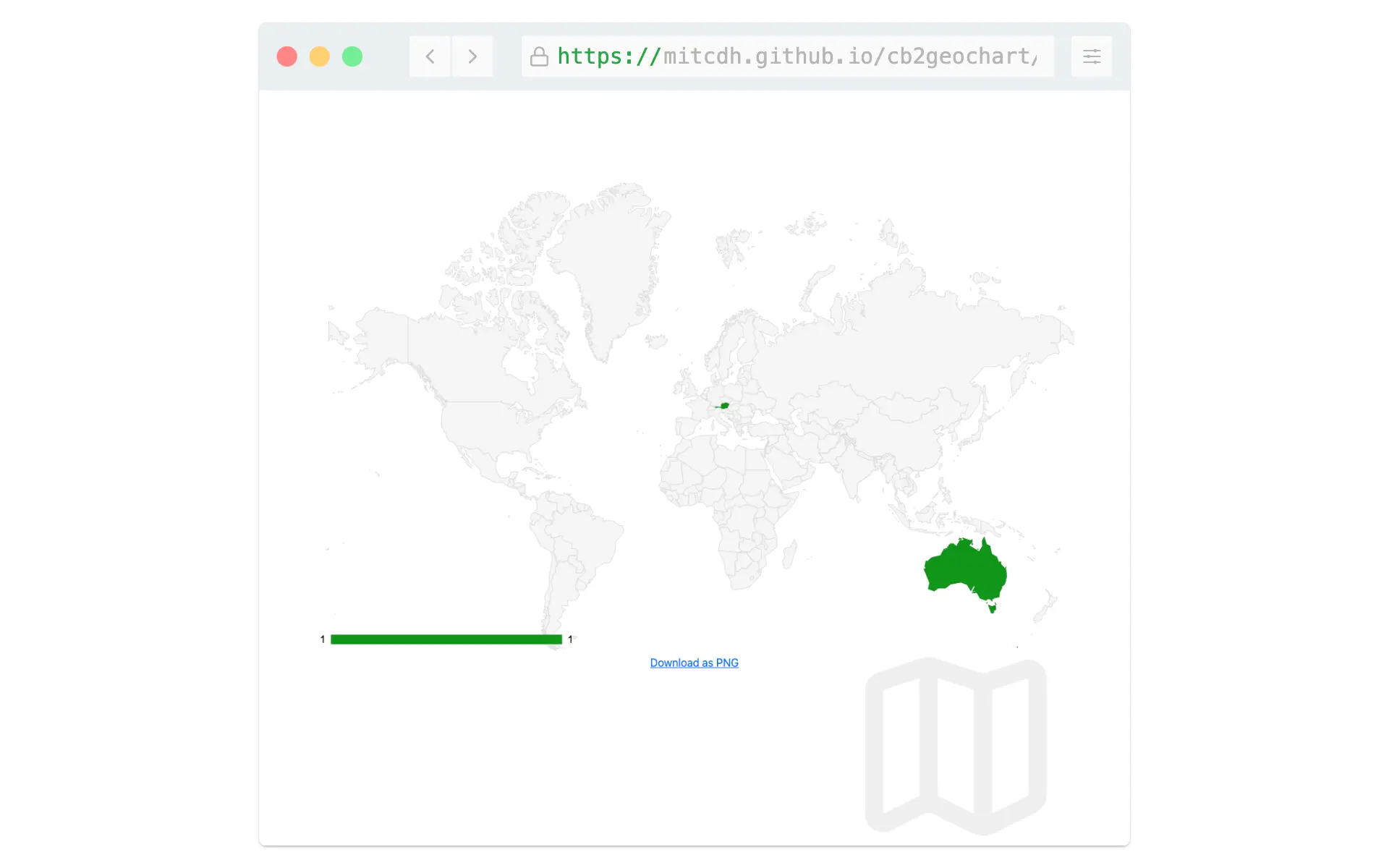 Example of a generated map

Older post
Scenes from Viennese Balls of 2023
Newer post
Rethinking Security: Function-based Protection Against Malice


